Policy Admin System
The Comprehensive Policy Admin System (COMPAS) is a web-based application used by one of the leading insurance companies to manage and store all customer details.

Client
United Healthcare
Team
4 Designers, 1 Design Engineer
Methodology
Design Thinking Approach
My Role
Lead UX Designer
Challenge
The existing application, developed nearly 30 years ago using JSP Views, faces a significant challenge. There is a pressing need to modernize its design to align with current industry standards and establish a responsive solution that delivers clean and consistent designs.

Understanding the existing application, create a new Design System to enhance and create a consistent user experience of internal applications for a leading insurance client in the US.
Goal
Lead design system managing team of 4 designers
Build and integrate a consistent, efficient design system
Design & document 380+ screens
Create and update the Figma component library
Journey Mapping
Mapping out the user journey helped us understand how users utilize the application and interact with its components. Additionally, it facilitated our comprehension of the pain points associated with each role.


Align and update Design System with the new product requirements
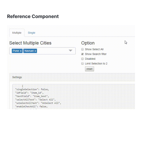
My design system knowledge was limited at the time of this project, and we began creating a comprehensive ecosystem of components using the Atomic Design process.
Defined foundational elements such as Color, Effects, Icons, Typography, and Spacing, drawing inspiration from their previous project. The aim is to narrow the gap between designers and developers, establishing a single source of truth that defines the guidelines for all necessary components.

Ideating base layouts with the stakeholders
sketched different layout variations to visualize how key components, such as the search bar, details panel, and control panels, could coexist across unique screens. This hands-on process helped me quickly test structural ideas, understand spatial relationships, and evaluate how users might interact with each component in context.

Quick Search Bar: Explored ways to streamline data lookup and reduce cognitive load through clear hierarchy and inline filtering.
Details Panel: Focused on flexible layouts that adapt to screen space, allowing users to view or collapse contextual details without losing their place.
Star Tribune Layout: Tested multi-column structures and grid responsiveness to optimize readability and balance dense information.
Log Preferences Panel: Experimented with personalization options, enabling users to customize display density and view preferences.
Testing Initial Concepts
By observing how users interacted with components to manage data and complete tasks in the application, I was able to identify what worked well and where each role encountered challenges. Based on these insights, I refined and improved the component guidelines.

Component Ideation
To address this, I explored multiple iterations:
Card Action Buttons (top-right): Provided quick access to common actions but added visual clutter and required users to scan multiple areas.
Custom Link List Component: Simplified access to grouped actions, improving discoverability and reducing redundancy.
Frozen Action Column: Solved the challenge of long tables by keeping critical actions (like View or Print) visible while scrolling horizontally—this tested highly with users for efficiency.
Hide Empty Columns (WIP): Allowed users to dynamically show or hide unused columns, making dense data tables easier to read and personalize.
I began by reviewing the current application’s data table, where action buttons were placed inconsistently and users had to scroll horizontally to perform frequent actions. Through user testing and feedback, it became clear that users needed faster access to key actions and better visibility of relevant data without excessive scrolling.
Based on user feedback and observed interactions, the frozen column approach combined with the hide-empty-columns control emerged as the most effective solution, offering a balance of clarity, usability, and flexibility for different roles managing fulfilment data.
Outcome
Users reported a 30% increase in satisfaction with the new design, citing a more visually appealing and user-friendly interface.
Improved User Engagement
The responsive design implementation led to a 65% improvement in accessibility across various devices.
Enhanced Accessibility
Stakeholders noted a significant improvement in the application's competitiveness and alignment with industry trends.
Positive Stakeholder Feedback