As the Lead Product Designer at the World Bank’s ITSDA division, I was responsible for shaping and scaling our design system to help teams move faster and more cohesively. When I joined, I inherited a complex but under-documented Figma library that created friction and inconsistencies, with limited alignment to the front-end implementation. Over time, I introduced clear documentation, established a culture of regular critiques and governance to guide the evolution of the system, and initiated collaboration with engineering teams to position the design system as a shared responsibility, bridging the gap between design and development.
Designing a design system for the World Bank Data Team
Role
Lead Product Designer
Team
Design systems engineer, Product design team
Impact
The changes quickly paid off. Designers began working with greater cohesion, relying less on ad-hoc or ‘rogue’ components and moving faster through iterative cycles. The governance process I established gave the team early visibility into how the system was evolving across multiple reporting tools, creating more opportunities for collaboration and alignment.
We extended this momentum to engineering, bringing in a dedicated front-end developer and initiating the process of translating the visual system into code. This shift not only strengthened the design-engineering partnership but also set the foundation for a scalable system that could support future World Bank reporting products.
Audit and preparation
Laying the groundwork to scale
When I joined the WBG Data Analytics Team, I inherited a bloated, undocumented Figma file. At the time, only a single designer was working on it, and it immediately buckled under the weight of broader use.
Most components lacked documentation. Where documentation did exist, it was directed at engineers for the immediate implementation of the component and was often out of date.
It was clear that additional variants and options had been added over time. Still, the documentation was never updated as well, leading to confusion about when to use which property and why.
The components themselves were brittle and complicated. Components did not cascade, and as a result, it was costly to make even minor adjustments to fix errors in the component. Any variations require breaking the component or adding to the long list of properties.
Pages with many components but no documentation populated the design system Figma file.
We were working with a design engineer, and the first task I put him on was to simplify the system that existed. Working with a front-end engineer, we catalogued all of the existing components and ordered them by how out of sync they were and how critical they were to repair.
At this time, I was rapidly hiring designers and contracting with an agency on a core new feature. If we didn't get ahead of the problem, we would create more debt for ourselves in the long run. The contractor's term ended at the end of the year, and I took over for the next phase.
Starting with the highest priority items we had identified, and working with the front-end engineer, I started to document each component in its current state.
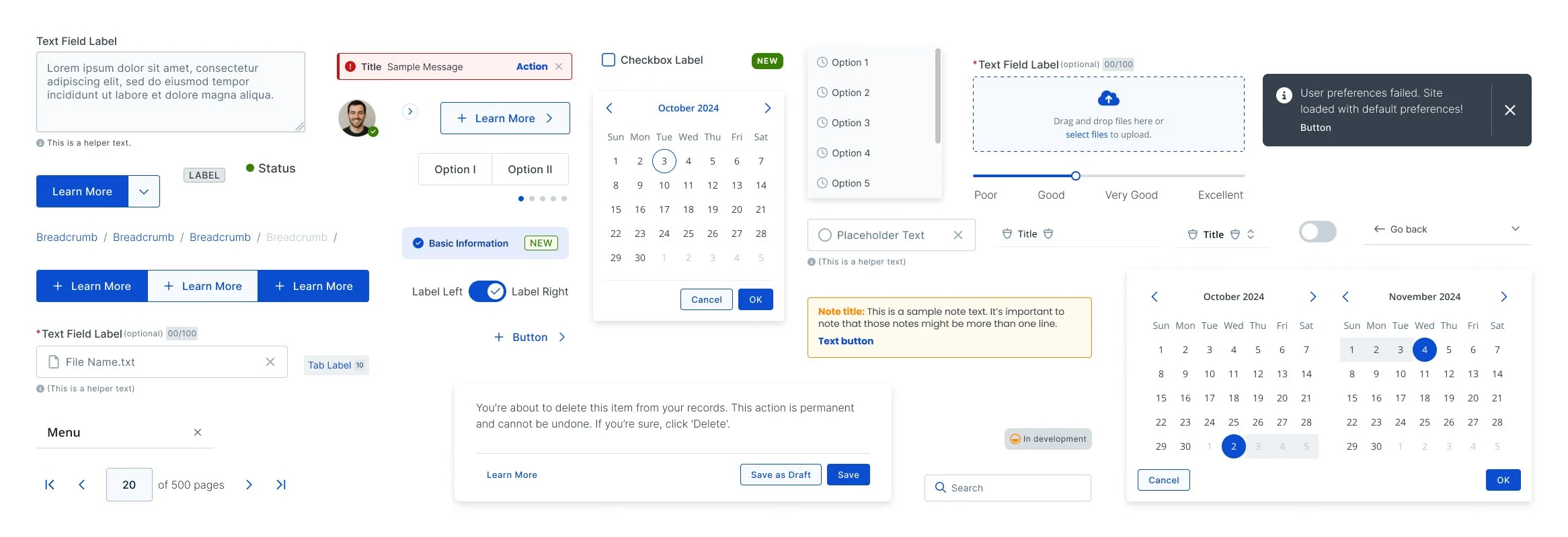
For reasons I was not involved in, our Storybook instance had been abandoned, and Figma was our only source of truth for design. I used Figma's new functionality around state components to demonstrate the interactions of each pattern to the best of our ability, given the tool, and showed in-depth documentation on usage guidelines and semantic differences across patterns.
Most pages consisted of the core components with multiple options grouped together in a large variant matrix. Documentation, where it did exist, was written to direct the build of the component, but not to guide its ongoing use
As I planned for the work of restructuring and documenting our components, I also started a campaign across WBG Data Analytics to educate on how design systems could support our product strategy goals.
To support this effort, I wrote an internal memo on our design system strategy and followed up with regular updates on the team's progress. This also supported the creation of a dedicated role in engineering to focus on design systems, which I helped recruit and interview for.

The List of Components we were able to build after the right strucure
Structure
Building on a philosophy of configurability
While I avoided rebuilding where possible, many of the more complicated components had to be refactored.
I pulled in my team to understand how and when we were using different variations currently. This helped us determine which properties to group together, which components to join as variants, and which to nest.
I wanted my team to avoid detaching components, but I also recognized that the pace of new work would result in new variants being identified.
To address this, I introduced slot components, which had just started to take hold after Figma's conference Config of that year.
Slot components allow the designer to change the content of a component or subcomponents without impacting the set structure of the primary component itself. For example, they could maintain the property spacing and details for a card and its header and footer, while adjusting the card's purpose to the design.
I built slot components into compound containers and components with uncertain variations.
The team was not familiar with this new concept, so I wrote up how-to documentation and held a training on this Figma capability.
Operations
Establishing a system of governance
Once I had stabilised the state of the design system components and documentation, I focused on the processes and structure that would help us evolve it together.
Contribution standards
I made use of Figma's branches capabilities to create rules for merging new components into the system. Designers were unblocked to incorporate new changes after they had received suitable review.
Shared ownership with engineering
I helped make a case for a dedicated role on the front-end engineering team focused on building out the coded component library and served on the interview panel to fill the role, with the goal of bringing the shared language closer together.
Clear and accessible documentation
While the engineering team worked on updating Storybook, I assembled a Figma prototype that housed our documentation that anyone could reference. This included deep dives into the use and constraints for each component, and general information on contributing to the system, easily navigable for quick use.
Critique and review
We updated our design template to add a dedicated location for any component variations or additions. Designers brought components to the design critique, and engineers had visibility into suggested permutations to provide early feedback. Overall, this helped us decrease creep, as we were forced to be much more intentional about accepted component changes.
Conclusion
Some lingering thoughts on design system principles & philosophy
I’ve coached teams within Cognizant on improving the adoption and efficiency of their design systems. Teams I’ve worked with have reported increases in quality and alignment, as well as increased stakeholder buy-in, and I helped the WBG Data Analytics team achieve the same outcome.
The anti-pattern I see teams fall into is focusing too much on the elements of design systems, namely the design components, library, and styles. However, the success of a design system hinges on its invisible parts–how to use it, when to evolve it, and why it matters for the overall success of the team.
The most effective design systems incorporate a shared vision between design and engineering, governance processes for reviewing new variants and components, a joint roadmap of prioritised updates, a philosophy of constructive critique, and comprehensive documentation that extends beyond Figma components.